
You’ve done the hard work setting up optimized headlines, images, and targeting for your ads. But when your prospects finally click on your ads, all you hear is crickets.
Does this sound familiar? If the answer is yes, that’s because you may be focusing on pre-optimization strategies and leaving them to go stale.
And with 97% of ad clicks ending without conversions, it means a lot of PPC budgets are being wasted on landing pages that aren’t optimized.
Therefore, you must be optimizing the landing pages your audience is driven to, convincing them to take a specific action.
Optimizing both your ads and landing pages can be a game changer for your marketing campaign. Let’s look at some of the best examples of how companies have perfected post-click optimization.
Post-Click Optimization: Why Should You Care?
Post-click optimization means putting a relevant landing page in front of your prospects to boost conversions.
In an optimized post-click campaign, your landing page will:
- Match the message of the ad your prospect clicked on
- Give them what they were searching for
- Have killer copy that engages with them
- A strong call-to-action (a conversion goal) relevant to the intent of the original search
If your landing page copy doesn’t match what your ad promised, your prospect will bounce. Simple. Not only will this leave you with no conversion, but your Google Ads relevancy score could be affected as well.
A Landing Page is Not Your Website
Think of your website as your headquarters. A stable building which holds all of your most important messages and information. A landing page, on the other hand, should be used as a welcoming handshake to a prospect.
It has a specific mission: to give information about a specific product or sale and to capture/sell leads.
Landing pages typically contain a compelling headline, trust indicators and social proof. But most importantly, they always have a compelling call-to-action that entices your prospect to fulfill your conversion goal.
The navigational features in comparison to your normal website are non-existent. This encourages your prospect to explore the landing page and will hopefully convince them to click on your call-to-action without being distracted.
Sound like a lot of work? It can be. But there are some simple rules you can follow to make sure each time you pay for an ad click, you’re giving your business the best chance at gaining a new customer.
Here, we’ll share some killer examples of landing pages from brands who have tried and tested their approaches.
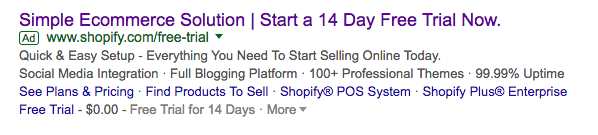
1. Shopify: Matching Your Ads Message
Matching your landing page copy to your ad copy will assure your prospect they’re in the right place. You’ll show them they can get what they came for and what they need to do to get it.
Your conversion goal may be to sell a product or download a free e-book. Whatever it is, make sure their landing page experience is relevant to their needs. Having a clear message will increase your chances of converting.
Doing it right: Shopify
Shopify is a trailblazer in the e-commerce space, and they’ve truly nailed their post-optimization marketing campaigns.
The Landing Page:
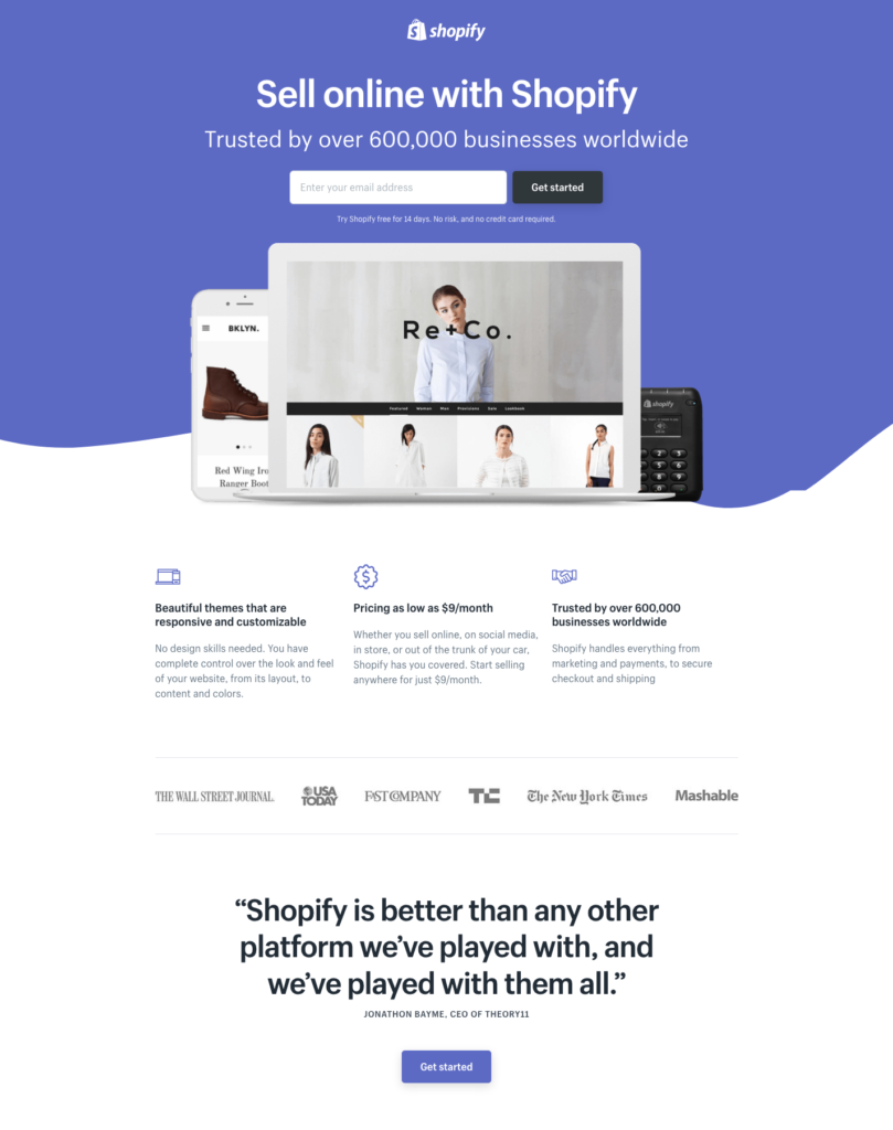
What They Do Well
Headline: Sell online with Shopify. It’s simple and to the point. It also highlights that they’re an e-commerce platform, which can possibly heal the customer’s pain point that led them to the landing page in the first place).
No distracting internal links: This is key to an effective landing page. There should be few (or no) navigational options on your landing page. This will distract your visitors away from making a decision to take action.
Clear value proposition: No gimmicks here. Their free trial offer is visible below the email form, so the lead knows what is being offered to them. Be upfront and honest with your offer from the start to minimize your landing page bounce.
Key Takeaways
Shopify did a great job of carrying their message from the paid ad, weaving it through their entire landing page copy.
Everything was served up to the prospect; a free-trial (and low prices afterward), easy to use/aesthetically appealing designs and, perhaps the most important of all, social proof. 600,000 businesses use the product, and having that stat in front of a prospect is certain to build trust.
Pro tip: Keeping ad messages consistent with landing pages will help you maximize your retargeting campaigns. If you know exactly which landing page a user has visited, you can retarget them with content they’re likely to be interested in.
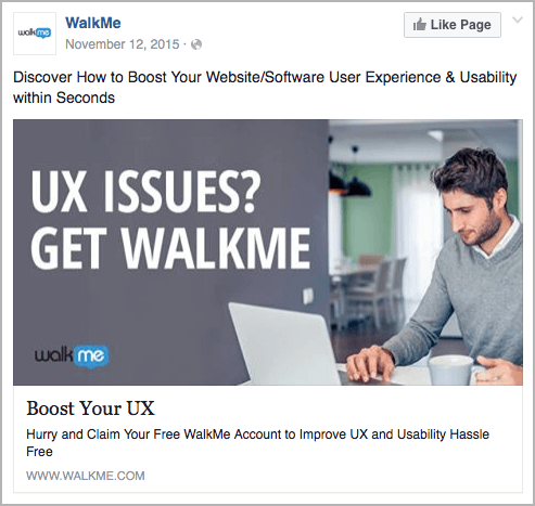
2. WalkMe: The 1:1 Conversion Ratio
A 1:1 conversion ratio is the optimum goal for any ad/landing page combo. It means your ad will promote one offer only, and your aim is to have your prospects fill one conversion goal (i.e. 1:1).
A 1:1 landing page creates a clear path for your customer, and also puts you in control of what conversion you want that to be. A landing page conversion goal refers to a “clickable element”, which is normally a call-to-action like a purchase or e-book download.
If you stray from the 1:1 rule and have more than one clickable element on your landing page, you risk distracting your prospect by giving them options. Not only does this derail your carefully planned customer experience, but it can reduce the chances of a conversion. You should aim for zero distractions and only one clickable element on your landing page.
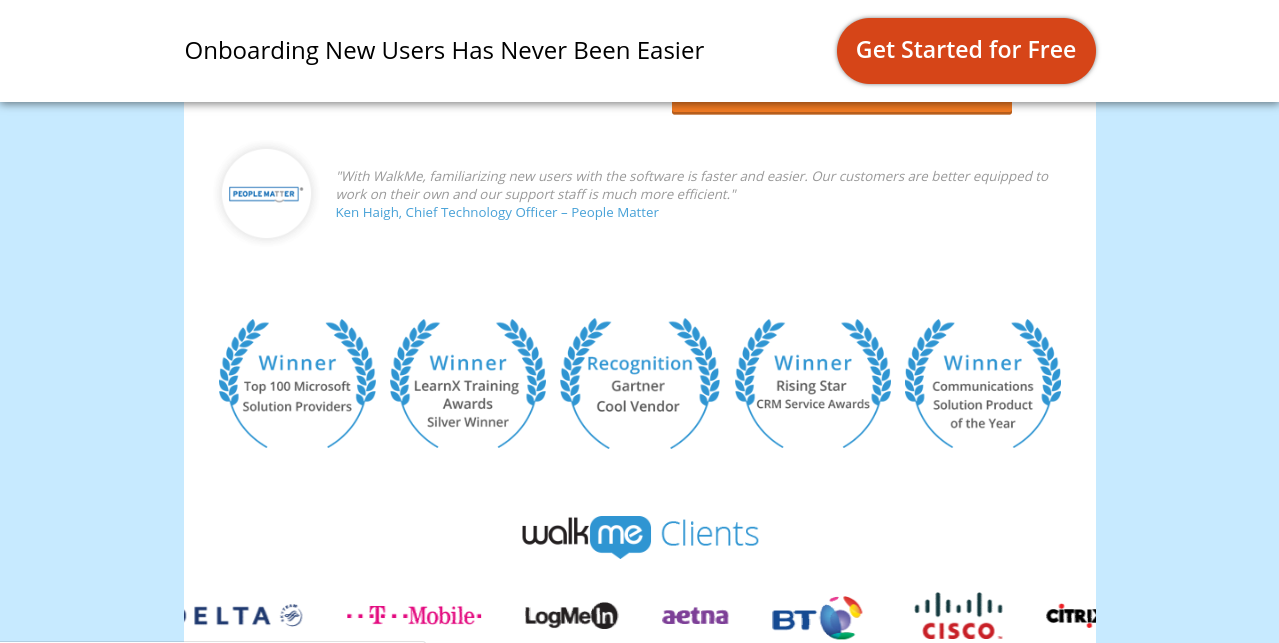
Doing it right: WalkMe
WalkMe is a SaaS company that helps users navigate the features of other web-based services with a minimal learning curve.
The Landing Page:
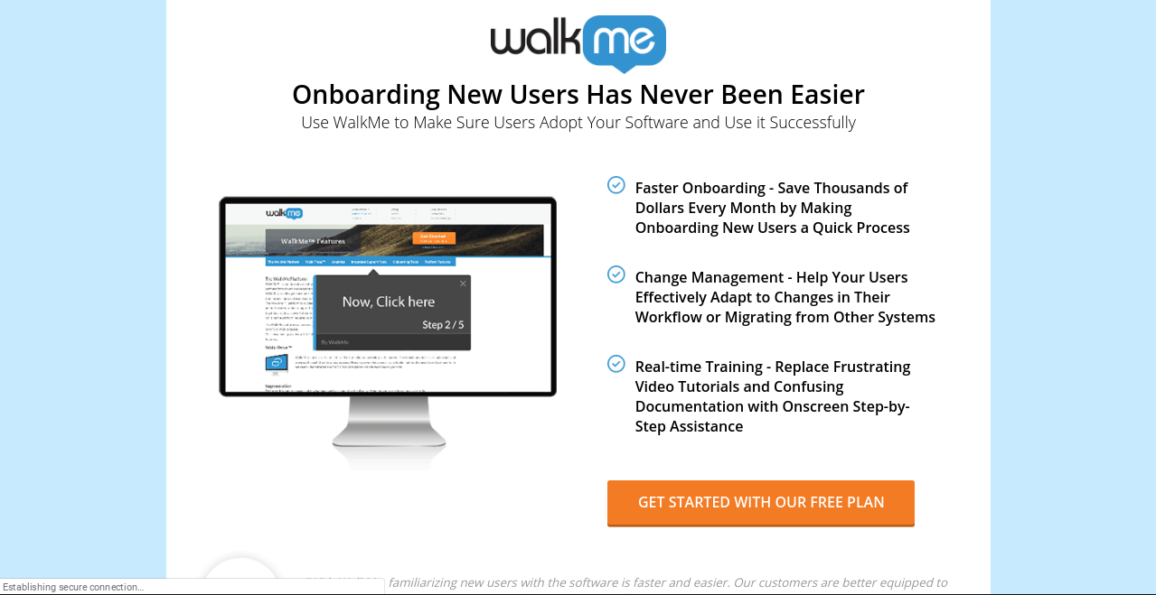
What they’ve done right
Single conversion goal: WalkMe only promotes one product throughout their entire landing page: a free plan. Not only is this weaved through the message from their Facebook ad, but it gives the prospect a clear and single action to take. No other price plans or upsells are mentioned.
Contrasting CTA button: The call-to-action is bold and grabs attention to persuade the user to click. While there isn’t a magic bullet for call-to-action button colours, by using a contrasting color you give it the best possible chance of grabbing attention.
Key Takeaways
WalkMe use clear conversion goals with their ads and their landing pages: to generate free trials. There’s no confusion with what WalkMe are offering to their audience.
Less is more when it comes to landing pages, and it’s your chance to create a clear, controllable pathway for your customers.
Pro tip: If your landing page requires scrolling for the user to read your copy, make sure your call-to-action doesn’t get lost. Pin it at the top of the page so your offer is always in the prospect’s view, just like WalkMe have done here:
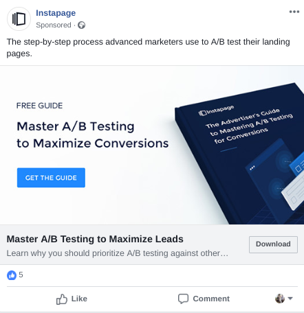
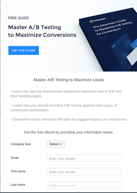
3. Instapage: Segment Your Users
So far, we’ve focused on landing page must-dos in terms of clickable elements and weaving your conversion goal into your ad copy. But there’s a way to get even more out of your post-click optimization, and that’s by segmenting your prospects.
Put the right content in front of the right audience by segmenting them by common traits and needs. The practice can help match specific ads with the right landing pages and, most importantly, make sure the user gets what they came for.
Instapage’s post-click optimization message is: all clicks are not created equal. This is true if your company offers several different products, and each of these products is targeting even slightly different user groups.
For example, Instapage sells customized landing pages to companies. But they also sell retargeting, Google Ad and Facebook Ad campaign software. If a user is looking for a solution for Google Ads, an offer about Facebook Ads won’t be relevant to them. Segmenting your users based on their specific needs can help here.
You can dig deep into segmentation by identifying geographic and demographic qualities, as well as the online behavior of your audience. Optimize every landing page your prospect visits absed on these traits to enhance the customer experience.
The Landing Page:
What They Do Well
Focus on the product they’re looking for: Instapage actually targeted me while I was writing this piece. While looking for examples of A/B tests, their ad landed on my Facebook feed. If they promoted one of their other services on my Facebook feed, I’d likely ignore it. But their segmented ad got my attention.
Optimize for the device: The landing page from the ad was optimized for the device I was using. It looked completely different on my laptop compared to my mobile device, which made it easier to see exactly what the company was offering and get the A/B testing guide.
Landing page design that matches the ad: They’re almost identical (in a good way). It gives the user a feeling that the process is streamlined and professional.
Key Takeaways
Instapage optimized every step of the customer journey to make sure the ad copy was relevant to what I’m looking for.
By optimizing how a landing page will look for your user on their device, you can make sure the landing page they view gets your conversion goal across.
Pro tip: When I clicked on the Facebook Ad from Instapage, the sign-up details were already pre-filled from my Facebook profile information. This made for a completely seamless sign-up process.
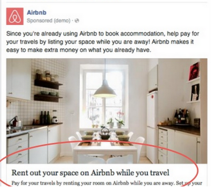
4. Airbnb: Getting Personal
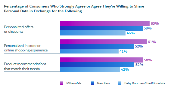
People love personalized offers. In fact, 78% of people won’t even consider an offer unless it’s tailored towards their needs.
On average, over half of us are willing to give up some personal information in exchange for offers and discounts to be geared towards us:
So, how do you go about personalizing your landing page experience? A simple trick like changing a geo-targeting feature, for example, can have a massive impact on a users landing page experience.
Doing it right: Airbnb
Airbnb is the world’s largest alternative accommodation provider. It’s used by more than 2 million people every single day.
The Landing Page
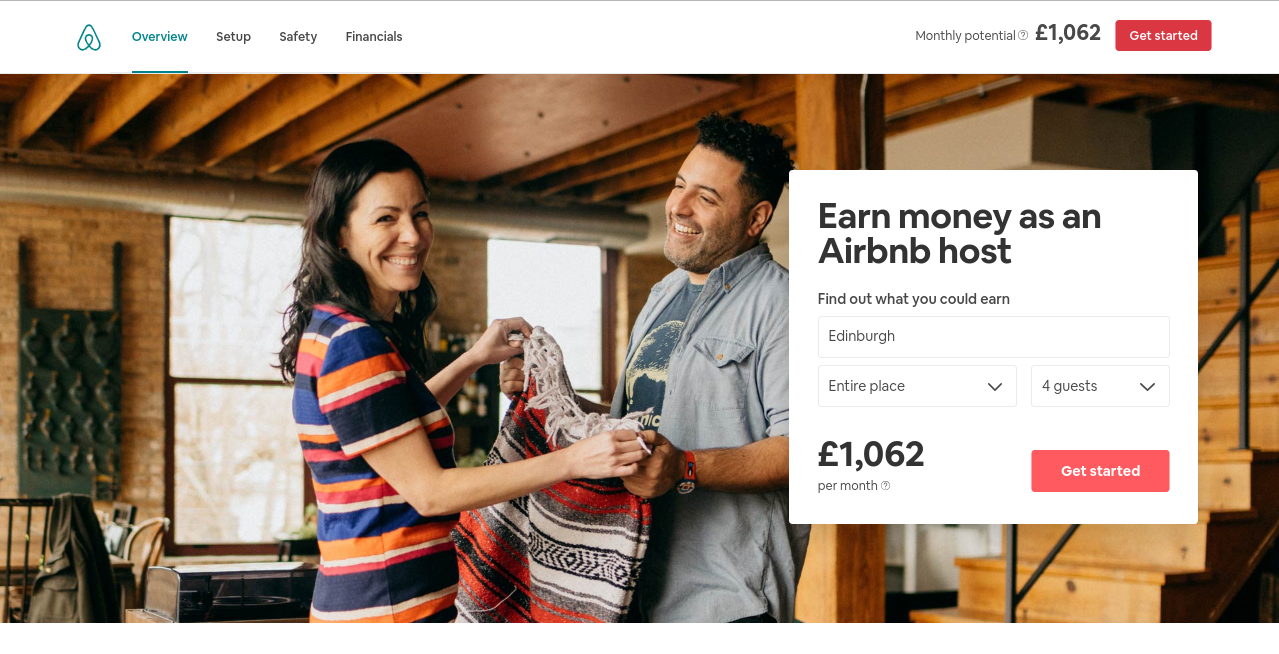
What They Do Well
It’s tailored to the visitor: Or so it seems. For landlords, it’s an enticing offer to see how much you can earn by renting out your space on Airbnb. The personalization stems from geo-targeting the landing page to match the prospect’s location.
A single call-to-action: This will entice the user to explore content on the page while fulfilling Airbnb’s conversion goal.
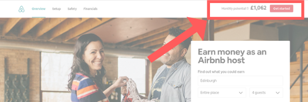
Clear customer journey: Once the prospect has found out how much they could earn using Airbnb, a personalized call-to-action is included in the right-hand corner of the screen. Again, this makes the next step clear at all times.
Key Takeaways
Airbnb made their conversion goal fun. Many users will see how much their property is worth on Airbnb without following through and renting it out. But, if they do decide to in future, we can hazard a guess on which platform they would look to first.
The goal of the page is simple: to let the user know what their reward will be if they join Airbnb. While there’s no free offer, by highlighting the user’s current city, Airbnb has managed to have a personal transaction with the customer without even asking for their email address. Even the currencey is personalized based on this location data.
Fun fact: This specific Airbnb landing page is optimized for geotargeting, devices and languages. It’s fully optimized, no matter who clicks on it.
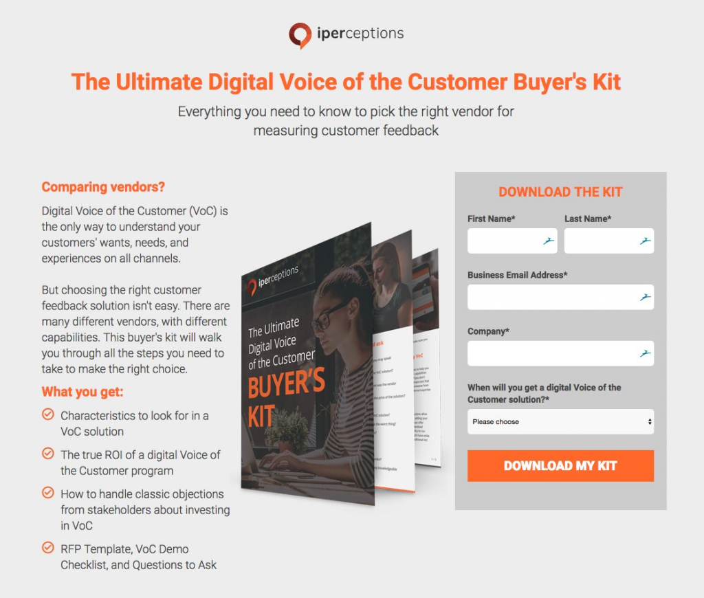
5. Iperceptions: Saying Thank You
With the work going into optimizing and segmenting landing pages, a surprising number of businesses forget to fulfil an important rule: saying thank you.
Connecting your optimized landing page to a personalized thank you page makes your new lead or customer feel appreciated. It also lays an important foundation to help build a strong relationship with your lead.
But the best part? It can also give your business another opportunity to convert.
Doing it right: iperceptions
Iperceptions is a customer experience management software platform that tracks customer feedback for online businesses.

The Landing Page
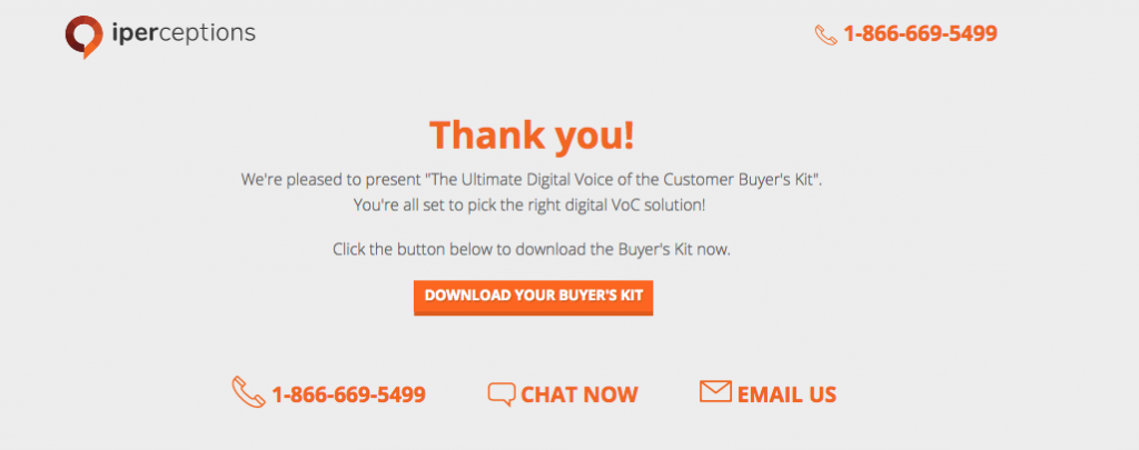
The Thank You Page
What They Do Well
Everything matches: The colours, the message, the branding. The user has no doubt that they are on the right journey to getting their free kit.
The headlines are identical: They’ve nailed one of the most important rules of post-click optimization as their messages are exactly the same. Once again, this eliminates confusion and keeps the user on the conversion path.
They create more conversion opportunities: What do you notice on the thank you page? The user has access to the free buyers kit, but they are also given four different ways to contact iperceptions. It’s a subtle yet powerful way to increase the chances of nurturing your leads.
Key Takeaways
Iperceptions kept their message, image and marketing clean throughout the buyer kit giveaway, while increasing their chances of another conversion with a thank you page.
Don’t underestimate how important saying thank you to a lead is, even if it’s just for downloading a free e-book. Customers that have a good experience with any transaction, even a free one, are more likely to look to that business in the future for a product in that field.
Pro tip: Even if you don’t want to create a custom “thank you” landing page, make sure you at least follow up through email. This shows your customer that you care enough to contact them (even about freebies), which will only strengthen your relationship!
6. Stride Tax: Using White Space
Sometimes, less is more. That’s certainly the case when it comes to landing page design.
White space is the term used by designers to de-clutter your landing page, which can give your lead a better user experience. Using white space in your ads and landing pages will draw attention to whatever your conversion goal may be.
Creating white space on your landing page also gives the user a clean page to browse. Your prospect will be able to breathe when they reach your landing page and digest your information easier.
The genius thing about white space is when it’s used in the right way, you won’t end up noticing it at all. Less clutter and fewer distractions lead to a clearer path for your lead to follow.
Doing it right: Stride Tax
Stride Tax is an app that allows users to track their mileage, receipts, and expenses for tax purposes (and, for free).
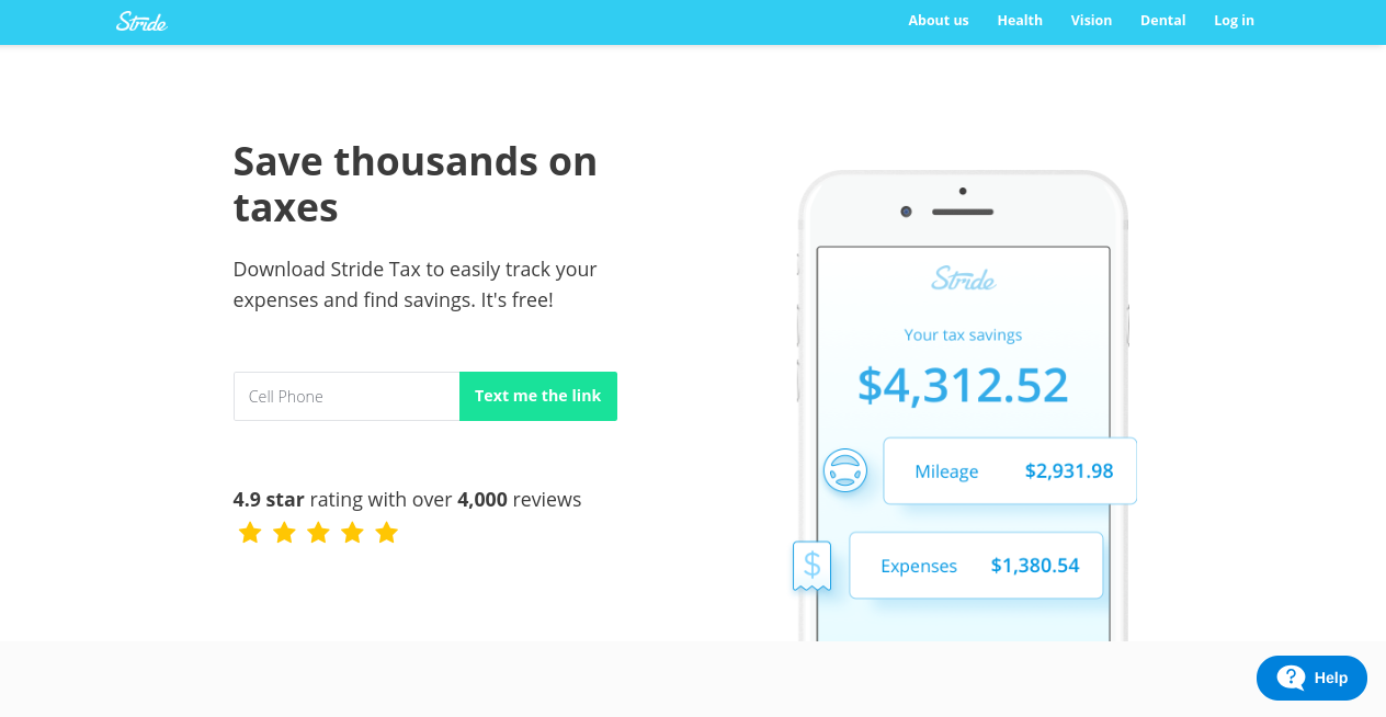
The Landing Page
What They Do Well
Again, one clear goal: Because Stride has allowed its conversion goal to speak for itself without distraction, it becomes the single point of focus for the user.
Focus separated by elements: The conversion goal is visually differentiated from other visuals on the page. In fact, you could take the graphic off the page completely and it wouldn’t drastically make an impact.
Key Takeaways
Many marketers feel the need to fill every corner of their landing page with copy, images and calls-to-action. Doing this can do more harm than good for your chances of converting a lead.
Use white space, and use it well. It will make your message clearer in a single sentence than bombarding your user with a landing page full text.
One Final Tip: A/B Test Everything
To get the most out of your post-click optimization campaigns, you should be constantly A/B testing every component of your funnel. You can do this by using heatmaps to see where your users have clicked (or bounced).
Check out some of these in-depth guides on how to A/B test your click-through-rates and test your Facebook Ads.
Follow These Best Practises to Hit Your Conversion Goals
Perfecting post-click optimization from your ads through to your landing pages is a strategic game.
You may find white space works amazingly well, while others convert more leads using segmented landing pages.
The key is to test a strategy and then test it again and again. Don’t be afraid to experiment with every aspect of your campaign. Keep going until your conversions are hitting a number that your team is happy with.
By following the 6 best practices in this guide, you are already giving your company the best possible chance of kicking your conversion goals.
Images:
Featured image: via Unsplash / Andrew Neel
Image 1: ConversionXL
Image 2: Perfect Audience
Images 3, 4, 5, 6, 7, 8, 11, 12, 16: Screenshots taken by the author, April 2019
Image 9: Salesforce
Image 10: Growth Hackers
Images 13, 14, 15: Instapage