Many charity fundraisers have significant skill at fundraising offline, but don’t realize that applying what they know to the web can easily double their online fundraising! Indeed, a lot of today’s conversion rate optimization – the practice of increasing the percentage of visitors who buy, give or become leads – has been long known to fundraisers working offline.
So stop making it so darn hard to give you money online, and find out how to translate those offline strategies to the digital world.
Here are seven easy-to-apply tactics that can help your organization raise significantly more online… and best of all, you’ve already seen these tactics work offline.

1) Tell a story about someone you serve.
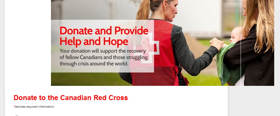
Everyone knows that numbers don’t move donors the way stories do. The millions of people with AIDS are less interesting than Jane, a single mother of two in Pointe-Claire who gave blood and got infected from a dirty needle.
Online, you can do this on your donation page by showing a picture of an individual whom you’re helping. Write – briefly – like it’s a news story.
- Who are you helping? Give an individual’s name.
- Why do they need help? Describe the problem
- What are you doing to help? Describe your activities
- Where – i.e. in what city or neighbourhood – are you active?
- When do you serve your audience? State your hours, special holiday activities etc.
Here’s a case study where a charity got more donations from doing just this.
2) Make it easy to give.
This conversion rate optimization rule breaks down into three different tactical applications.
a) Delete any fields that aren’t necessary on your form.
On the phone or in person, you don’t start asking for random information like company name. You stick to the credit card and where to send the receipt, right?
The same applies online.
Here’s a list of unnecessary fields:
– Title: (i.e. Mr/Ms/Mrs) etc
– Phone
– Fax
– Job Title
– Company
– Second address
– Comments
This on its own will help you a lot.
What about fields that some people use but others don’t? For example, gifts in honor of others, gifts on behalf of a company etc.?
If it’s a whole alternative person/organization/address to send the receipt to, group the fields together, after the billing info, and only display it if someone clicks a button indicating they need it.
The same principle – show the field only if asked – applies to the other optional things like gifts in memoriam, second address field etc.
Alternately, you can just have a phone number or live chat for people who want to give on behalf of a company or in someone else’s honour.
b) After someone has given, save their details for future giving.
All this requires is three things.
First, you create a password (that they can edit later) and email it to them along with their receipt.
Ensure the subject line mentions ‘password’ so that it’s easy to find the email and password for future use. This, in combination with their email, is how they’ll login later.
Second, at the top of the donation form, you need a button or link for ‘donors with saved details.’ This opens the email/password login, tied into your database.
Third, you need a secure database for storing the information.
Offline you increase conversions of prospects to donors with this tactic too: “Would you like to give with the Mastercard we have on file, ending 1234?”
c) Auto-fill fields when possible.
If you’re speaking to a potential donor who lives in Montreal, you don’t need to ask them for province and country, right? Technology allows you to do similar things – even if you don’t have the visitor’s details saved.
If you know someone’s postal or zip code, you can then auto-fill city, state/province and of course country.
Likewise, you can infer the credit card brand based on the the starting numbers.
3) Give context to gift sizes
Rather than leave gift size to chance, contextualize it to increase average order size. There are a few ways to do this:
- First, show default gift size options in decreasing order, i.e. biggest to smallest.That way the choice is not between the smallest gift and a medium gift, but as a choice between the biggest and a medium size gift
- Another approach is to tell donors what each gift size buys. E.g. Feed someone for a day, Vaccinate twenty people etc.
- A third approach – and this is closest to your offline method with past donors – is to show what they’ve given in the past.
Typically you’d do this with specially coded links sent to your email list. Upon being clicked, the links inform your site of the donor’s giving history with a “cookie.
When these visitors see the donation page, they see a pre-defined donation amount showing their past donation size (and optionally bigger gifts). You can also use these cookie links to greet these visitors on your site by name.
4) Match your call to action to the form headline
The default text on a form completion button is “Submit.” The problem is that “Submit” is vague and has been proven repeatedly to be unclear.
In addition, it doesn’t match the headline for your form (you do have one, right?). Typically the headline will read “Give To Support {Charitable Activity X}.” E.g. “Give To Vaccinate Kids In Botswana.” “Give To Feed The Homeless In Downtown Montreal.”
So the form completion button should say “Give To Vaccinate Kids In Botswana,” or “Give To Feed Downtown Montreal’s Homeless.”
5) Speak the donors’ language(s).
Literally.
You wouldn’t talk to a potential donor in person in a language that they don’t speak or only speak at a second language level.
So your donation form should also be multilingual.
In Canada, you’ll want forms to be in both French and English. In the US, a Spanish translation will be helpful. On the west coast, Chinese and India’s various languages should also get consideration.
Summary of today’s conversion rate boosting tips for charities’ donation pages:
Your offline experience at fundraising can help you generate more donations – and bigger donations – online. We covered 7 conversion rate increasing tactics where this overlap exists:
1) Tell a story about who you’re helping. Make an emotional appeal, not a statistical one.
2) Delete unnecessary fields from your form.
3) Save donors’ details for repeat donations (even if they chose one-time gift).
4) Auto-fill fields, like city, state and card type.
5) Give donors a comparison point to contextualize how much they should give.
6) Repeat your form headline in the completion button.
7) Offer a donation page in the donors’ language.