
This post comes courtesy of our friends at Sleeknote.
Making a strong first impression is a must-do for brands today.
Which is exactly why you can’t afford to squander your “thank you” and confirmation pages.
Setting the appropriate tone and expectations, such pages are incredibly valuable real estate for any given brand.
Why? Because the actions you encourage your leads to take will determine whether or not they stay in your funnel for the long-term.
From encouraging sales and social followers to nurturing leads and building trust, the opportunities afforded by you “thank you” pages are seemingly endless.
Which begs the question – how do you know if your own “thank you” message is up to par?
How to Put Together the Perfect ‘Thank You’ Page
Spoiler alert: there is no “right” way to craft a “thank you” page.
However, there are a number of critical elements to your pages that set the stage for a positive, long-term customer relationship.
In this guide, we’ll break down the pieces of an effective “thank you” page. The examples below highlight the sheer creative freedom that’s available to brands, while also reviewing best practices.
Whether you’re working in ecommerce or the SaaS space, any combination of these elements is totally fair game.
Start with Congratulatory Copy
First thing’s first: communicating to your leads that whatever action they’ve taken was successful while also making them feel like a million bucks.
Perhaps they joined your mailing list, made a purchase or signed up for a webinar.
Either way, they need to know that they’re getting something in return for their information and attention.
Because while people are more than willing to opt-in, they also deserve a sort of warm, fuzzy feeling in exchange for their details.
That’s why something as simple as a “thanks” or “congratulations” in your headlines can do the trick. Although this might seem like a no-brainer, you might be surprised at how few brands actually open up with a warm welcome.
This “thank you” page from Skillcrush is seriously simple but likewise effective. The bold “CONGRATULATIONS” creates a positive sense of hype that’s impossible to miss.
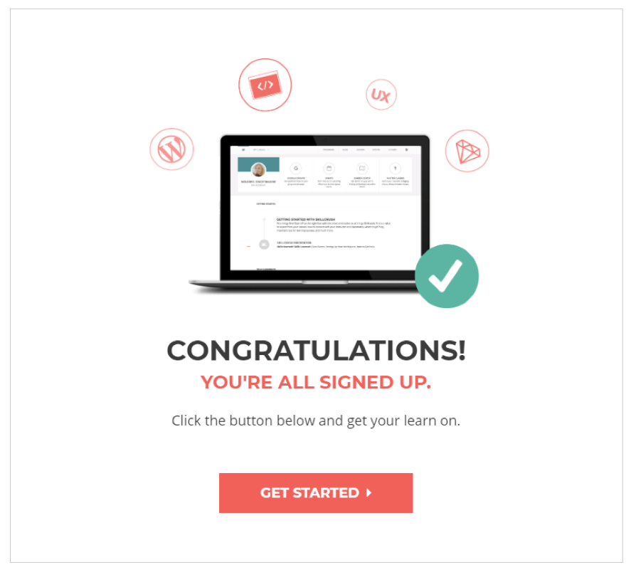
In short, the visitor manages to feel like they’ve accomplished something simply by handing over their information.
Many brands likewise make their “thank you” pages reinforce that customers are now part of a unique community.
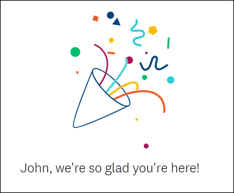
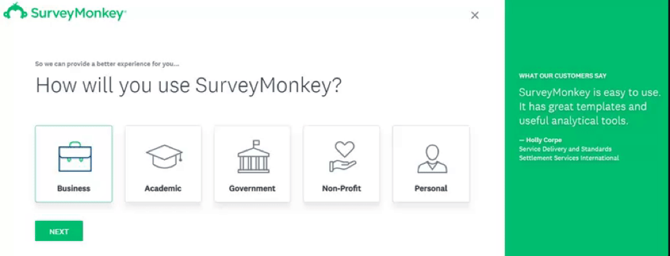
For example, this greeting serves as the loading screen for giving SurveyMonkey a test-drive.
Greetings and conversational copy on your “thank you” pages are low hanging fruit for not only buttering up your leads but also showing off your personality.
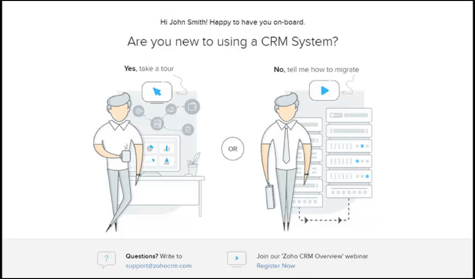
This “happy to have on you on board” message from Zoho is another shining example of a warm welcome. The personalization features such as referring to opt-ins by name and giving them a choice in next steps create a brilliant experience for visitors.
This fluid transition from a greeting into doing something is a far cry from stuffing your CTA into a confirmation email.
And hey, that leads us directly to our next point.
Provide a Crystal Clear CTA
“Thank you” represent are a sort of make-or-break moment for leads.
They can either click out of your page and into their email, where you essentially risk losing their valuable attention.
Or they can start taking action immediately from your “thank you” page.
Listen: your leads shouldn’t have to wait around wondering what to do next.
As such, a call-to-action needs to be front and center. Some common CTAs that we see on “thank you” pages include…
- Sharing a purchase or download on social media
- Social sharing buttons to encourage long-term followers
- Links to a helpful or otherwise relevant piece of content
- Recommendations for future products
You can further highlight your CTA with bold, actionable copy and contrasting colors so they’re can’t-miss.
Let’s look at some examples.
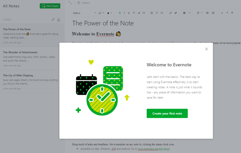
This welcome pop-up from Evernote encourages new users to get started immediately to familiarize themselves with their platform. This makes the app seem actionable and intuitive, all the while the green button highlights a specific next step.
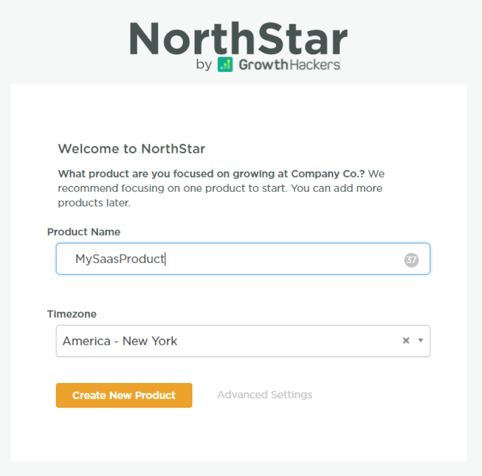
NorthStar by GrowthHackers offers up a similar sort of “let’s dive in” approach to their welcome page. Creating a product from the get-go encourages visitors to get to know the platform ASAP.
Oh, and peek that loud yellow button.
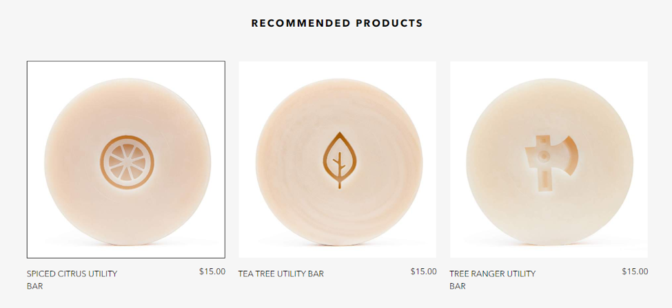
Who says that “thank you” pages can’t be transactional?
Recommending products to your latest leads is a smart move, especially for ecommerce brands where recommendations result in a lift in conversions and sales.
Beardbrand’s “thank you” page also establishes that opt-ins will be receiving updates, offers, and deals on a regular basis.
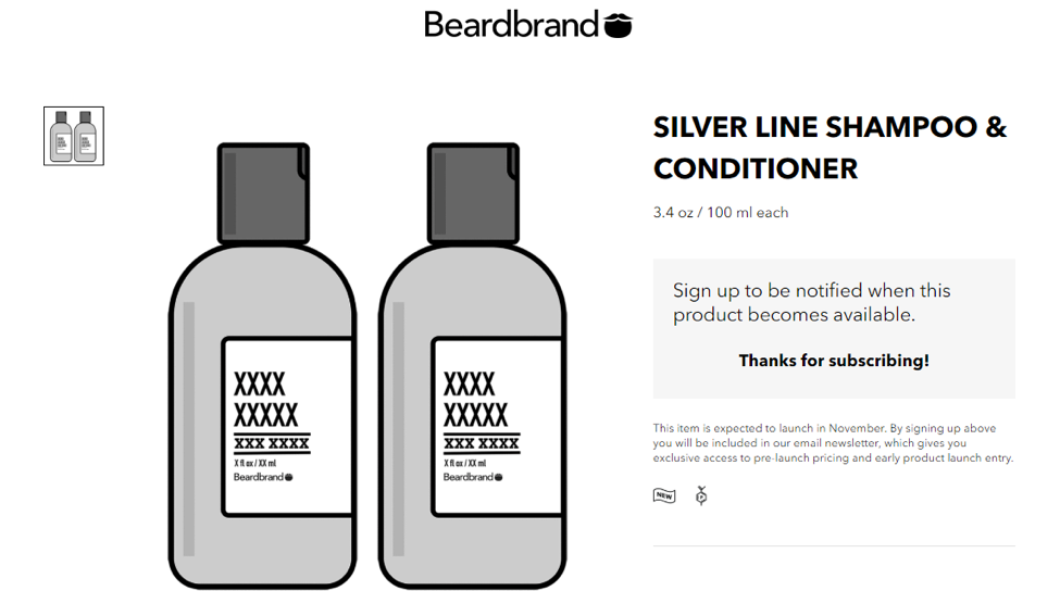
This means that such opt-ins are more than happy to spend and signals their intent to do so. There’s nothing “spammy” about pushing products on a “thank you” page as long as your opt-ins are expecting them.
This example from AdEspresso is straightforward but it works. The download button is obviously where visitors are drawn, but the follow invitation likewise signals the brand’s expertise.
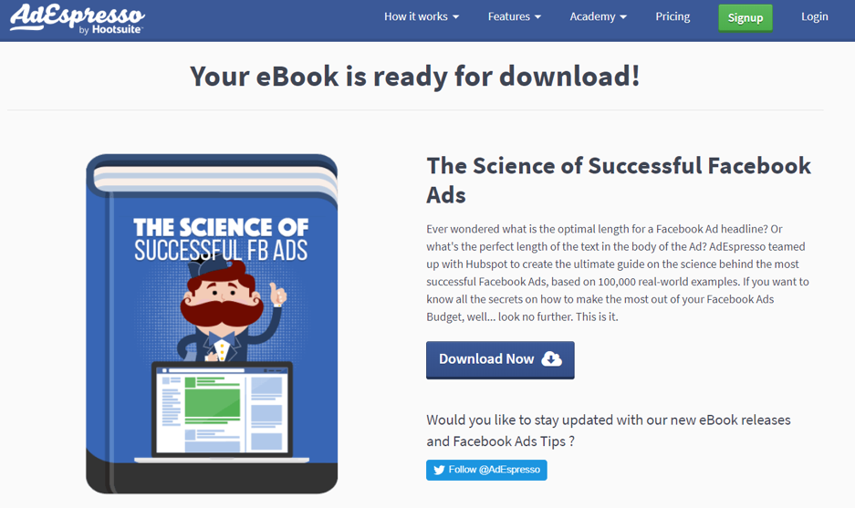
While the chunk of text preceding the CTA might seem excessive, the copy manages to stress the value of smashing that “Download Now” button.
And speaking of value…
Highlight Value-Driven Next Steps
“Okay, but what’s in it for me?”
This is the exact question your “thank you” page should be able to answer at a glance.
Again, leads need to feel like they’re being rewarded for their attention and trust.
Although providing discounts or exclusive content is a good start, stressing the value of your visitors’ involvement is an even better-added bonus. This paints you as a helping hand rather than someone who’s looking for a quick cash-grab.
This “thank you” page from Modcloth is incredibly busy, but also highlights the value behind a sign-up. For starters, new opt-in’s are met with…
- A free shipping and return offers
- A referral discount
- Sizing and style suggestions
- A place to log measurements and find the best fits
- A “love items” section that encourages further browsing
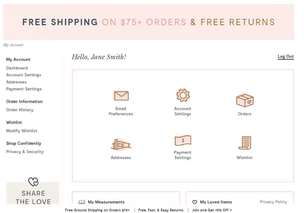
Each of these actions is framed as a bonus and ultimately encourages opt-ins to spend some serious time on-site.
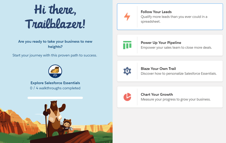
Salesforce takes a unique approach with their “thank you” page, providing four specific action items.
Every action item is coupled with a value-packed subheader (ex: “qualify leads than you ever could in a spreadsheet”) while the walkthrough completion bar psychologically drives visitors to want to keep pushing forward.
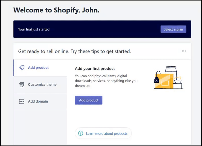
Meanwhile, Shopify offers new users multiple avenues to get started with their service. Either through adding a product or reading a comprehensive blog post, users of all shape and sizes are empowered to supercharge their storefronts.
Seamless Design
A common thread between many of the best “thank you” pages is that they get straight to the point and keep people progressing.
Because when communicating all of the above, it pays to be as clear and concise as possible.
This means either doing as much as you can “above the fold” or funneling leads to take action via savvy design.
SurveyMonkey’s mini “quiz” prior to their welcome page helps pick the users’ brain and leads to a more personalized experience. The testimonials on the sidebar for each industry is also a brilliant design move, serving as social proof along the way.
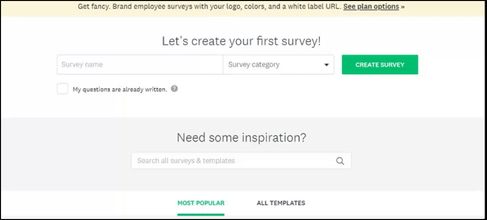
As far as the “thank you” page itself, users are met with a list of templates that signal just how easy to whip up their own survey.
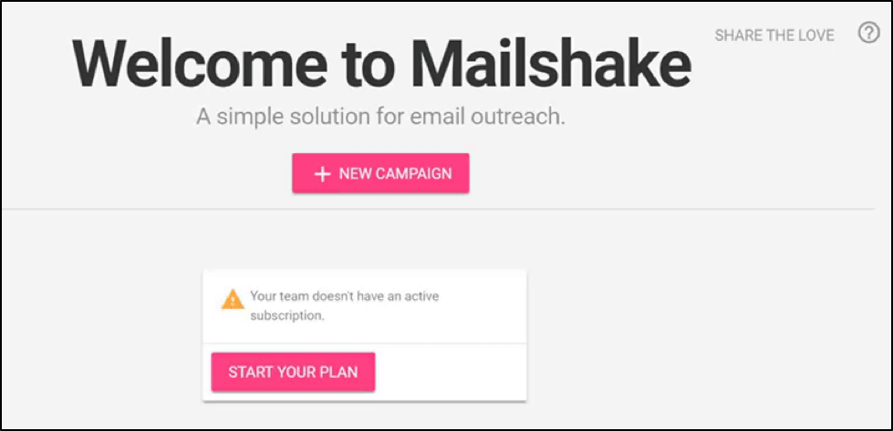
MailShake’s “thank you” page ticks all the boxes of a great user experience. Above the fold, users can start their campaigns or share how much they love the app. The bright pink buttons are a nice touch for drawing visitors’ eyes in.
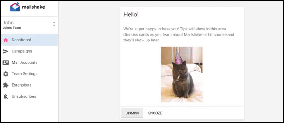
Below the fold are a series of scrollable tips and bite-sized information for new users. Kicking off with a warm welcome from a cat meme, this sort of experience is definitely atypical. That said, the natural scrolling progression of the app tips does indeed move users from Point A to Point B.
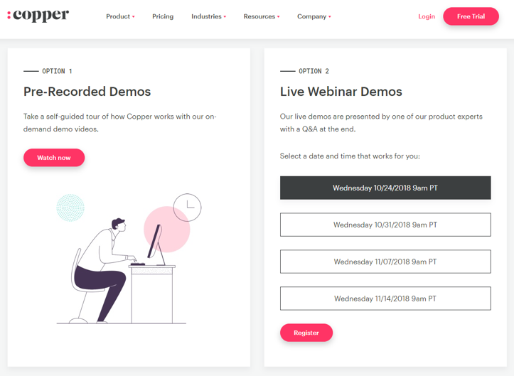
Copper’s confirmation page is yet another example of how important clear CTA buttons and color schemes can be. Additionally, the “Option 1” versus “Option 2” represents good UX, giving opt-ins a choice for next steps based on their personal preferences.
More Examples of Effective ‘Thank You’ Pages
To wrap things up, we’ll highlight some effective “thank you” pages that can serve as further inspiration.
If there’s one takeaway from these examples, it’s that there’s no shortage of options when it comes your pages’ tone, copy, and design. They can honestly be as busy or simple as they need to be, granted they tick the boxes above.
But let’s take a moment to break down a more “minimalist” example.
The Minimalist Approach
Backlinko’s “thank you” page proves that you don’t need a ton of bells and whistles to get the job done. The short, simple copy feels akin to an old-school marketing email or letter which is still as effective as ever. Note the conversational tone that doesn’t feel “salesy” whatsoever.
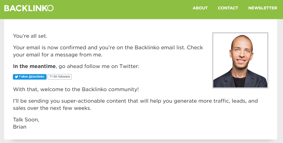
Meanwhile, the headshot makes the message seem even more personal. In just a few lines, Brian Dean is able to set expectations, provide next steps and hype up the benefits of being on his list.
Not bad, right?
The Humorous Approach
“Thank you” pages are a prime place to put your brand’s voice on display.
Some brands choose to go the humorous route, which is exactly what Chili Piper does.
During the opt-in process, Chili Piper provides visitors the options to either schedule a meeting or call right then and there. If you decline or otherwise wait too long to respond, you’re met with this tongue-in-cheek “thank you” message.
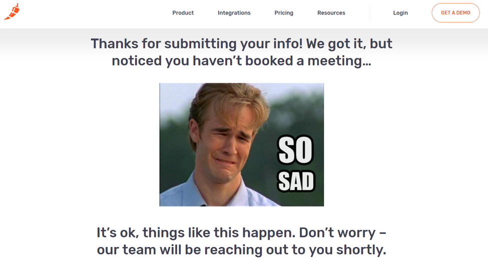
The meme provides this message with a playful tone, but it’s effective nonetheless. It sets the tone of the brand while also giving opt-ins a heads up that somebody will be in contact. For companies whose products or industry might be perceived as “pushy,” this sort of tone makes perfect sense.
The “Thank You” Video
Videos are known to lower bounce rate, making them perfect candidates for your “thank you” pages. Rather than force your opt-ins to scroll through a wall of text, a brief explainer video can work wonders for holding someone’s attention.
Teachable’s “thank you” delivers in that department. The personable, candid approach is compelling and creates a much-needed sense of hype for the company’s upcoming webinar.
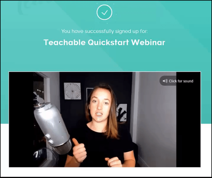
This “thank you” page doesn’t solely rely on its video to be effective, though. Action items such as creating a free account or adding the webinar to your calendar help keep the page interactive.
And really, that brings this guide full circle.
Because it’s so important that your leads make as many touch-points as possible with your brand, especially after they’ve opted-in or made a purchase.
With a well-crafted “thank you” page, you can do all that and then some.
How Are You Saying “Thank You” to Your Leads?
When it comes to winning long-term customers, a proper “thank you” page can make all the difference.
Think about it. Such pages set the tone for that ever-so-important customer relationship.
Maybe they need a nudge to take those next steps. Perhaps they need some hand-holding or conditioning to take action.
Either way, you can’t just do nothing.
As highlighted by these “thank you” page examples, you have tons of creative freedom in creating your own pages that totally crushes it.
And hopefully, this guide served as some much-needed inspiration to do exactly that.
Image Credits:
Feature Image: Unsplash / kevin Xue
All screenshots taken by author, November 2018.
Image 1: via Skillcrush
Image 2, 11-12: via SurveyMonkey
Image 3: via Zoho
Image 4: via Evernote
Image 5: via NorthStar by GrowthHackers
Image 6-7: via Beardbrand
Image 7: via AdEspresso
Image 8: via Modcloth
Image 9: via Salesforce
Image 10: via Shopify
Image 13: via MailShake
Image 14: via Copper
Image 15: via Backlinko
Image 16: via Chili Piper
Image 17:-18 via Teachable