 How do you make your PPC landing pages jump off the screen?
a. By giving your visitors cheesy 3D glasses? Everyone looks sexy in those.
b. By designing with animated Gifs, CSS sprites, and excessive Flash?
c. By optimizing your landing pages with the 3 Dimensions of the conversion trinity developed by Bryan Eisenberg?
Did you guess right? Fresh off Bryan Eisenberg’s online presentation 2 weeks ago where he introduced his conversion trinity; a simple but very effective way to optimize your PPC landing pages by examining the following 3 dimensions:
1. Relevance: Focusing on understanding the intent of your visitors and delivering the most relevant content for their needs.
2. Value: Making sure your visitors understand the value of purchasing from you.
3. Call To Action: Making sure that your visitors not only know what action they should take next, but that they feel comfortable taking it as well.
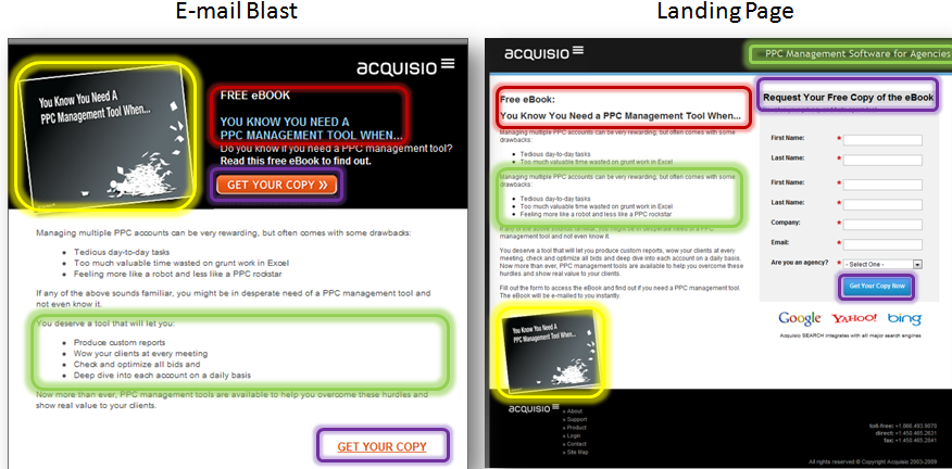
To put this more in perspective for you, I’ll show you how we’ve used the trinity internally to develop a landing page for our new free eBook: You Know You Need a PPC Management Tool When… (see my analysis below the graphic.)
1. Relevance
We’re in the business of PPC, talking about PPC to the people who like PPC. Think of it the same way you would about your keyword targeting and ad placement.
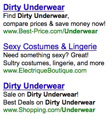
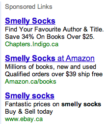
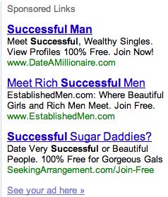
Just like a PPC ad, when a visitor clicks on your offer, you’ve only done half the job by making it compelling enough and click-worthy. Finish off the job by making sure that your landing page not only matches the offer, but reinforces it. This offering is about a free eBook and so is the landing page.
Besides, you don’t really want your ads looking like this:
You want them to look more like:
2. Value
I’m sure your offer is unique and valuable, but what are you doing to convey that to your visitors? This is where your unique value proposition (UVP) needs to be prominent on the page to remind your visitors of why you’re not only a relevant, but the best solution for their problem. This where you also get to harness the power of copywriting to convey the value of your offer in an easy way that stands out.
In this case, Acquisio’s UVP (PPC management software for agencies) is loud and clear at the top of the page. We’ve also used concise bullet points that first communicate pains the visitors can relate to, then benefits they can use to overcome their problems.
3. Call To Action
Nothing is worse than a visitor bouncing off your page because they didn’t know what to do next. It’s your job to hold their hand and guide them throughout the whole experience, until you lead them to the action you want them to take.
To ensure that, we’ve designed our call to action buttons using action verbs with implied benefits that are relevant to the offer. “Get Your Copy” vs “Submit” or “Download”.
Finally, a little scent doesn’t hurt. We’ve made sure our e-mail blast and landing page are not visually disconnected by using the same template, pictures, and wording.
Whether you’re currently running some ads you can evaluate, or thinking about creating some new ones, make sure you keep those 3 dimensions in mind to create relevant, valuable, and actionable landing pages that pop off the screen for your visitors.


